

You know that sinking feeling when your campaign results come in and they’re just… average? Not terrible, but not great either. You’ve crafted the perfect email sequence, the design looks sharp, and your offer is solid. But when you check your Dynamics 365 dashboard, everything looks mediocre.
Here’s what probably happened: Your campaign was actually crushing it in Phoenix while completely bombing in Portland. However, your dashboard combined everything into one unimpressive average.
Sound familiar?
This happens more often than you’d think. You’re looking at overall performance numbers that hide the real story. Some regions are responding like crazy to your messaging, while others are giving you the cold shoulder. Without geographic context, you’re flying blind.
Your CRM Is Hiding the Truth About Campaign Performance
Let’s be honest – your current reporting setup is probably letting you down. Most CRM systems show you data in these flat, boring formats that tell you almost nothing about WHERE your campaigns actually work.
You get excited about a 20% open rate without realizing it’s 35% in some places and 8% in others. That’s not insight – that’s just math. When your boss asks why you’re not seeing traction in the Southeast, you end up making educated guesses instead of giving real answers.
Think about your last campaign. You probably spent weeks perfecting every detail, from subject lines to call-to-action buttons. But when results came in, you had no idea that your outdoor gear campaign was killing it in Colorado while completely flopping in Florida. Makes total sense now, right?
This naturally raises the question: “Why don’t standard CRM dashboards provide this kind of regional breakdown?” The reason is that most systems are designed to capture and present performance data, not to visualize it geographically. Valuable differences by region get averaged out, hiding the real story behind campaign performance.
Your reports treat New York the same as Nebraska. They lump Texas in with Vermont. This approach might work for accounting, but it’s terrible for marketing optimization.
The worst part? You’re probably leaving money on the table. When you can’t see geographic performance patterns, you miss opportunities to double down on what’s working and fix what isn’t.
| Expert Tip: When evaluating campaign performance, don’t just look at regional response rates in isolation—overlay them with external market factors such as demographic density, competitor presence, and seasonal demand patterns. For example, a region with lower open rates might still hold strategic value if it aligns with long-term growth markets or underserved customer segments. By layering external context onto CRM insights, marketing teams can avoid making short-term cuts that could limit long-term expansion opportunities. |
What Happens When You Can Actually See Your Data
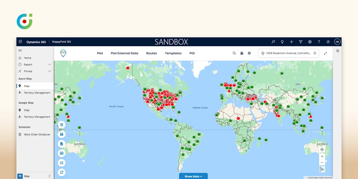
For a change, instead of staring at spreadsheets or PPT, you’re looking at your campaign performance on an actual map. Hot spots where engagement is through the roof show up in bright colors. Cold zones where nobody cares about your carefully crafted messages appear in muted tones.
This is what changes when you visualize your Dynamics 365 Marketing data through MappyField 365 maps. Your static data suddenly comes alive with geospatial marketing insights that reveal meaningful patterns.
You can filter by state, city, or even ZIP code. Want to see how your campaign performed in Texas versus California? A few clicks and you’ve got your answer. Need to understand why suburban areas are outperforming urban ones? The patterns become obvious on a heat map.
A question that often comes up is: “Isn’t this just another layer of visualization rather than real insight?” [b]In reality, the mapping goes beyond visuals. It highlights patterns and correlations that raw numbers can’t. By connecting performance with geography, marketers gain context that explains not only where a campaign is working but also offers clues as to why it’s working there.
The real game-changer is overlaying product interest with location data. You might discover that winter gear sells like crazy in Minnesota (obviously) but also unexpectedly well in parts of Texas. Who knew?
With consistent CRM syncs, you can track campaign performance as data updates and visualize trends over time. Some regions respond immediately, while others need time or different messaging. You’ll start to see patterns you never noticed before.
Here’s something interesting: Regions with high email opens but low conversions may indicate message fatigue, low engagement quality, or irrelevant offers. Those areas don’t need more volume – they need fresh creative.
Smart marketers already map ROI. Stay ahead! Turn your Dynamics 365 data into a clear strategy.
Setting Up Geographic Insights (It’s Easier Than You Think)
Don’t worry – setting up ROI mapping in MappyField 365 won’t require a computer science degree. The process is pretty straightforward once you know what you’re doing.
Connect Your Campaign Data
Start by syncing your Dynamics 365 CRM data with MappyField 365. This ensures all your response metrics (opens, clicks, conversions) flow properly into the mapping system. Once you set it up, data can be synced manually or scheduled to keep your campaign metrics up to date.
Configure Geographic Filters
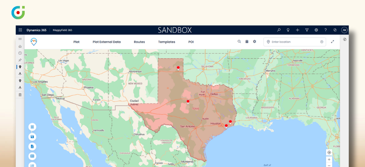
Set up filters to view performance by region. You can slice your data by state, city, or postal code. Pro tip: start broad with states, then narrow down to cities or ZIP codes depending on what you’re trying to figure out.
Activate Heat Map Visualization
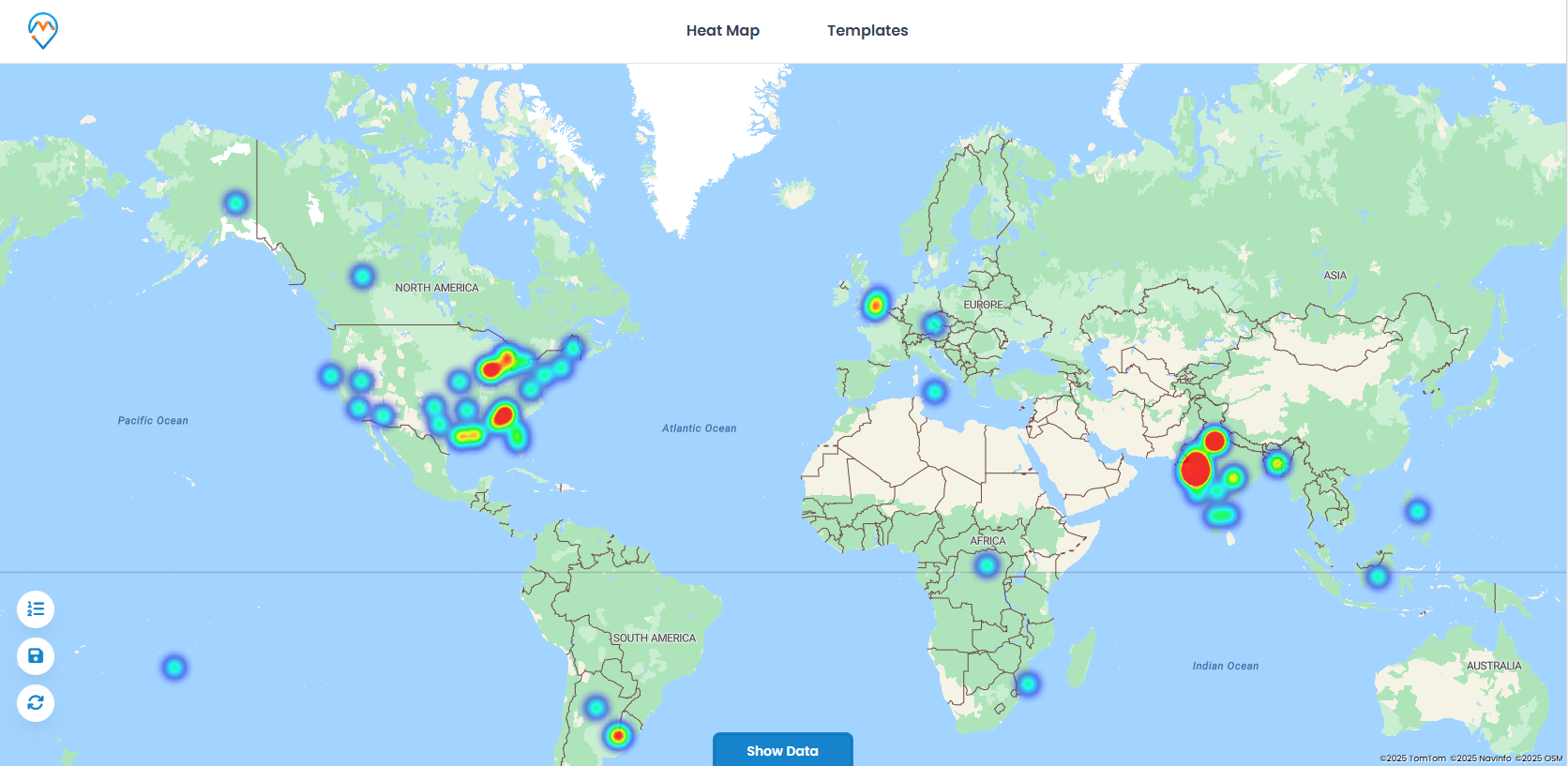
Turn on the heat map tool and watch your data transform from boring spreadsheet rows into colorful, interactive visualizations. High-performing areas glow bright, underperforming regions show up muted. It gives you a clear, visual view of campaign performance you can’t get from spreadsheets.
Investigate Cold Spots
For regions showing low ROI, dig deeper to understand what’s going wrong. Maybe the demographics don’t match your assumptions. Could be market saturation. Sometimes it’s just timing – some campaigns work great on weekdays in certain regions but only on weekends in others.
Export and Share Insights
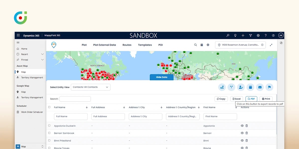
Export(image or PDF) your visual maps for presentations. Instead of showing your boss another boring PowerPoint with charts, you can pull up compelling map visualizations that tell the story instantly.
Remember to cross-reference your campaign heat maps with actual sales territory data. Sometimes, high engagement doesn’t translate to revenue, and sometimes low engagement masks really valuable customers.
How This Changes Your Team’s Approach
The benefits hit almost immediately. Your team will finally understand why certain initiatives struggle while others succeed beyond expectations.
Smarter Budget Allocation
Instead of spreading money evenly across all regions, you can invest heavily where you’re actually getting results. Companies often shift 60-70% of their paid social budget to high-performing metropolitan areas and see cost per acquisition drop by 30% or more.
Faster Problem-Solving
When campaigns underperform, you can quickly identify specific causes. Is it message fatigue in oversaturated markets? Demographic mismatch? Seasonal factors? The geographic patterns give you clues to work with.
Better Team Collaboration
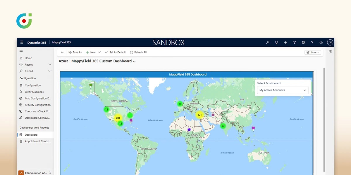
Field sales reps can see which regions are responding to marketing efforts. Customer success teams can understand geographic usage patterns. Everyone works from the same visual data instead of trying to interpret different reports.
Executive Presentations That Actually Work
Maps are more compelling than spreadsheets. When you can show leadership a heat map of campaign performance across the country, with clear hot spots and cold zones, it tells a story that numbers alone never could.
The combination of Dynamics 365 Marketing insights with geospatial marketing capabilities gives you the complete picture. You see not just what happened, but where it happened and why it matters.
| Expert Tip:
Geographic data doesn’t only highlight opportunities. It also uncovers risks. For example, overdependence on one high-performing region can leave the business exposed if local conditions change, such as regulatory shifts or competitor dominance. By identifying where revenue is concentrated and where diversification is needed, marketing teams can proactively spread investment, reducing vulnerability and creating a more resilient growth plan. |
A Real Example That Shows the Power
Here’s what happened to a furniture retailer that thought they had a campaign disaster on their hands. They launched what seemed like a nationwide email campaign for a spring sale. Initial results looked pretty disappointing – low open rates, mediocre clicks, terrible conversions.
The marketing director was ready to kill the campaign and start over. But when they mapped the data using MappyField 365, something unexpected emerged.
Urban areas were indeed performing poorly. But rural ZIP codes? They were going absolutely crazy. High open rates, strong click-through, solid conversions. The campaign wasn’t failing – it was just succeeding in places they hadn’t thought to measure.
So they pivoted quickly. Sent targeted SMS follow-ups to the high-performing rural areas. Adjusted their messaging to better resonate with rural customers. Created specific offers for small-town demographics.
The result? 25% increase in regional sales that quarter. What started as a “failed” campaign became one of their most successful initiatives ever.
This shows how Dynamics 365 map integration can completely flip your perspective on campaign performance. Sometimes your campaign isn’t broken – you’re just looking at it wrong.
Why This Integration Actually Matters for Your Business
After trying various mapping tools over the years, MappyField 365’s integration with Dynamics 365 stands out as genuinely different. It’s not just another dashboard – it fundamentally changes how you think about campaign performance.
Its integration is seamlessly with Dynamics 365 Marketing, and it offers a familiar interface too. Teams can quickly adopt map-based visualizations through MappyField 365 with minimal onboarding and no need for extensive retraining.
What really sets it apart is the real-time optimization capability. You can adjust campaigns while they’re running based on geographic performance. Identify underperforming regions mid-campaign using MappyField 365 heat maps, then adjust targeting or budget allocation in Dynamics 365 manually to improve ROI.
One question that often surfaces is: “Isn’t real-time optimization just another way of saying faster reporting?” The distinction lies in actionability. Faster reporting tells you what happened more quickly, but real-time optimization means campaigns can actually be adjusted while still active—reallocating budget, refining messaging, or shifting targeting instantly. This moves insights from passive observation to immediate impact.
The geospatial marketing insights also help with long-term strategic planning. You start to see patterns across campaigns and seasonal variations by region, and spot changes in your own customer data over time. It enables you to forecast performance trends and plan future campaigns with greater precision.
The Reality Check You Need
Geographic visualization has become absolutely essential for any marketing team serious about ROI. When you integrate MappyField 365 with Dynamics 365, you unlock insights that can transform your entire approach to campaign management.
Teams regularly increase campaign ROI by 40% or more just by understanding where their messages actually resonate. The insights are sitting there in your data, waiting for you to discover them.
Look, this won’t solve all your marketing problems. But if you’re tired of guessing where your campaigns work and want to start seeing results on an actual map, this is probably the most impactful change you can make to your current process.
Your geographic data exists in Dynamics 365. With MappyField 365, you can visualize it to uncover actionable insights and regional trends.
You can keep staring at flat reports that hide the real story, or you can start seeing your campaigns the way they actually perform – geographically. The choice is yours.
Ready to stop guessing and start mapping your success? Try MappyField 365 today and watch your marketing ROI take shape right on your screen.


